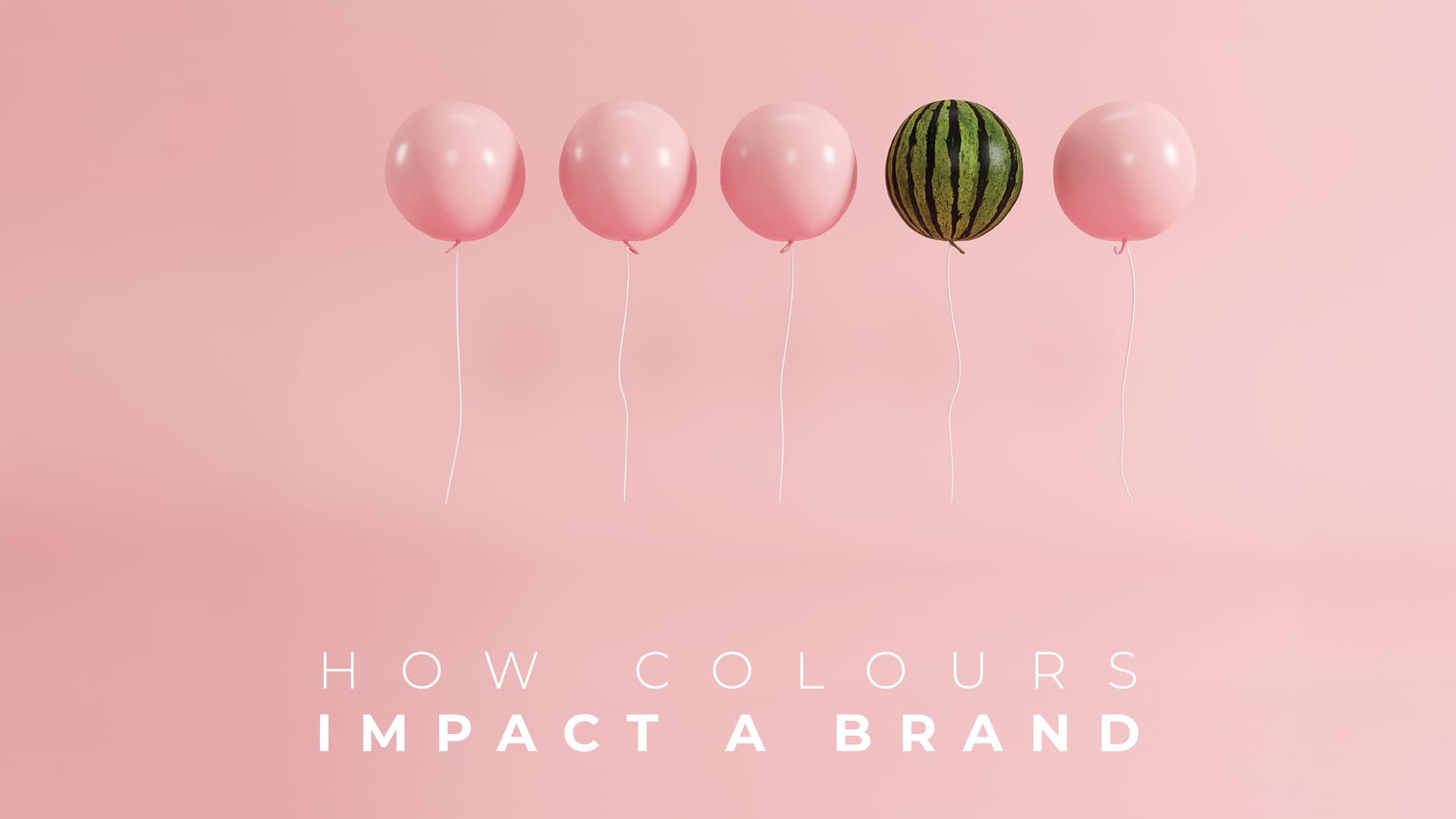
The Power of Colour in Graphic Design
In the dynamic world of graphic design, one element has the power to evoke emotions, communicate messages, and captivate audiences like no other—colour.
The strategic use of colour can significantly impact your brand’s visual identity and leave a lasting impression on your target audience. In this article, we’ll explore the importance of colour in graphic design and provide you with five practical tips to implement, as well as five key points to avoid potential problems. Whether you’re a small business owner or a marketing enthusiast, understanding the significance of colour can elevate your design game and effectively communicate your brand’s personality.
Here are five tips for harnessing the ‘Power of Colour’:
Understand Colour Psychology | Colours have the ability to evoke specific emotions and associations. For example, warm colours like red and orange can stimulate energy and excitement, while cool colours like blue and green can create a sense of calm and trust. Research colour psychology and consider the emotional response you want to elicit from your audience when choosing your brand’s colour palette.
Establish Brand Consistency | Consistency is key in branding, and colour plays a vital role. Select a colour palette that aligns with your brand’s values, personality, and target audience. Consistent use of colours across your marketing materials, website, and social media platforms creates brand recognition, fosters trust, and reinforces your brand identity. In fact, a study found that consistent branding can increase revenue by up to 23%.
Consider Contrast and Accessibility | When designing your visuals, ensure there is sufficient contrast between the background and text or graphics to improve readability. Additionally, consider the accessibility aspect of colour choices. Avoid relying solely on colour to convey important information and make sure your design is accessible to individuals with colour blindness or visual impairments. Strive for inclusivity and use colour as an enhancement rather than the sole means of communication.
Use Colour to Direct Attention | Colours can guide the viewer’s attention and highlight important elements within your design. For instance, using a vibrant colour for your call-to-action button can draw the eye and encourage user interaction. Additionally, using colour strategically in infographics or data visualisations can help differentiate between different data points or categories, making information easier to comprehend.
Test and Iterate | Don’t be afraid to experiment with different colour combinations and variations. Conduct A/B testing or gather feedback from your target audience to assess the impact of colour choices on their perception and engagement. Continuously refine and iterate your designs based on the insights gained to optimise your visual communication.
There, however, some potential pitfalls you will want to avoid:
Overwhelming Colour Schemes | Using too many colours in your design can lead to visual clutter and confusion. Stick to a limited colour palette (typically 2-4 colours) to maintain visual harmony and prevent overwhelming your audience. Remember, simplicity and clarity are crucial in effective design.
Poor Colour Contrast | Insufficient contrast between text and background colours can make your content difficult to read. Ensure there is a clear distinction between foreground and background elements to enhance legibility, especially when designing for print or digital platforms.
Inconsistent Colour Application | Inconsistency in colour usage can dilute your brand’s visual impact. Create a style guide or brand guidelines that outline specific colour codes, usage guidelines, and variations for different mediums. Consistent application of colours will strengthen your brand identity and avoid confusion.
Cultural Sensitivity | Colours can carry different meanings and cultural associations. Be mindful of the cultural context and symbolism attached to colours when designing for a global audience. Conduct research or consult with professionals to ensure your colour choices resonate positively with diverse cultures and avoid unintentional misunderstandings.
Ignoring Colour Trends and Industry Standards | While it’s important to stay true to your brand’s identity, keeping up with colour trends and industry standards can help your designs feel fresh and relevant. Monitor design trends and colour palettes in your industry to ensure your visuals remain current and resonate with your target audience.
The effective use of colour in graphic design is a powerful tool that can enhance your brand’s visual impact, evoke emotions, and communicate messages with precision. By understanding colour psychology, establishing brand consistency, considering contrast and accessibility, using colour to direct attention, and testing your designs, you can harness the power of colour to create captivating visuals that leave a lasting impression on your audience.
Avoid potential problems by ensuring a balanced colour scheme, maintaining sufficient contrast, applying colours consistently, being culturally sensitive, and staying updated with industry trends and standards. If you need assistance in leveraging the power of colour in your graphic design efforts, Funky Vibes is here to help.
Contact us today at 03333 604 117, email us at findmytribe@funkyvibes.co.uk, or book a consultation in seconds using our website funkyvibes.co.uk/book-a-consultation. Our team of experienced professionals can provide expert guidance and support to enhance your brand’s visual communication. Let’s make your brand shine with the perfect colours!
If you would like to know more please get in touch!
If you would like to chat with a member of our team or learn about the benefits of any of our services, simply book a consultation now.
Alternatively, you can get in touch by calling 03333 604 117 or by using our contact form